SOLIDWORKS 2018 What’s New – SOLIDWORKS Visualize 2018 New User Interface – #SW2018
SOLIDWORKS 2018 What’s New – SOLIDWORKS Visualize 2018 New User Interface – #SW2018
What’s more exciting than User Interface redesigns?!? If you said pretty much anything, just wait a minute there partner. This year’s user interface changes for SOLIDWORKS Visualize are awesome, helpful, and productive!
The first major user interface change option you’ll see is the ability to switch between Dark and Light themes. While some of this supports just user preference there’s actually some real benefits to having the ability to switch. If your eyes are straining too much you can always use the classic dark theme. But I’ve noticed that while the dark theme certainly isn’t as taxing on the eyes, using it makes me tired. Follow me a second here, it’s 8:00 am you’re working on 4 hours of sleep and you need to take care of a few rendering jobs. Consider using the light theme as it is much brighter and has helped a certain Application Engineer who shall remain nameless wake up substantially better than the dark theme counterpart. So, consider the Light Side Luke.

The next user interface change users will see with SOLIDWORKS Visualize 2018 is the icons have been cleaned up and spaced apart. This improves the selection process for users and give a great clean modern feel.
![]()
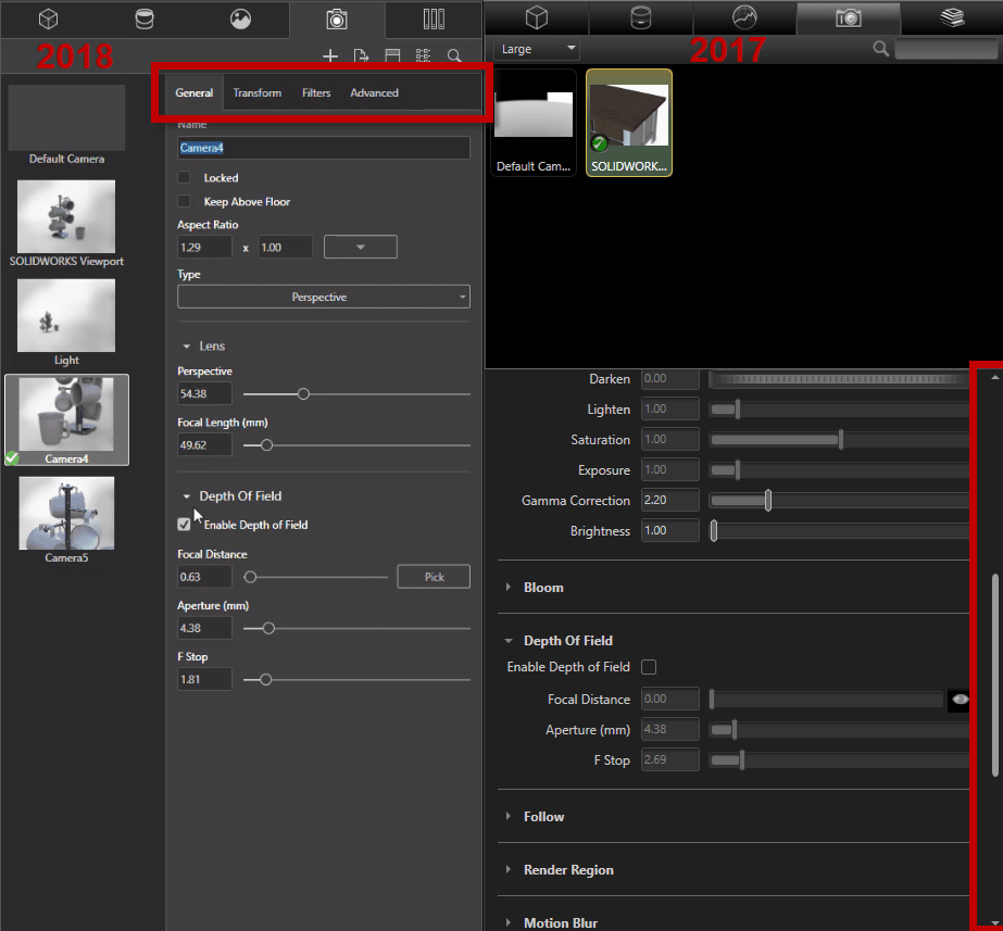
The last and probably most significant and important change the SOLIDWORKS Visualize 2018 user interface is all about simplification and ease of use. SOLIDWORKS Visualize is phenomenal with the level of control and multi-functional ability it gives users. But sometimes all those options and all that power can get a bit cluttered. Luckily with SOLIDWORKS Visualize 2018 the palettes have been modified with simple sub-tabs to reduce excessive scrolling.

Not only do the cleaned up sub-tabs minimize scrolling, but users also have more controls closer to the main tabs compared to the same real estate space in the 2017 counterpart.
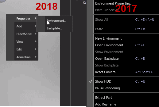
Also, Right Mouse Button menus have been modified to have sub contexts to help minimize lengthy windows. Now you can quickly navigate to your desired options without searching a large list.

I hope this part of the What’s New series gives you a better understanding of the new features and functions of SOLIDWORKS 2018. Please check back to the CATI Blog as the CATI Application Engineers will continue to break down many of the new items in SOLIDWORKS 2018. All of these articles will be stored in the category of “SOLIDWORKS What’s New.” You can also learn more about SOLIDWORKS 2018 by clicking on the image below to register for one of CATI’s Design Innovation Summits.
Brandon Nelms
Application Engineer
Computer Aided Technology, Inc

 Blog
Blog 